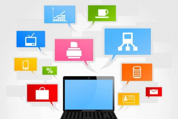
Friction is any element of web design that comes between users and their goals. Friction leads to frustration, increases bounce rates, and results in fewer conversions. When a customer visits your website, you want their attention to be on your products, services, and information. When they can easily click through to their goal, they enjoy the experience. When they have to think about where to find things and how to use your website, they feel frustration. Friction results in lost sales.
Good Friction vs. Bad Friction
Information architect Steve Krug referred to friction as cognitive load. For the most part, friction should be avoided, but in some situations, it’s helpful.
Good friction promotes interaction. Sometimes users can be so busy zooming through your website that they miss key information. Use friction to slow users down and point their attention at what’s important.
For example, friction prevents customer mistakes by asking for confirmation when checking out. The data they’re asked to review might be on a previous page, but showing it to them again and asking them to agree it’s correct creates good friction.
When users fill out forms and miss a required field, the prompt to enter missing data causes irritation, but most users are willing to fill in what they missed in order to proceed.
Bad friction distracts, confuses, and irritates. It comes from unfamiliar features and visual clutter. Good designers create an environment that is free of bad friction.
Steps to Avoid
Keep things where they should be. Put your search field at the top where people expect to find it. Keep your main menu, shopping cart, and other items where they’re easy to see. Be creative with other aspects of web design, but if you want users to perform specific tasks, make it easy and predictable. Label them clearly. Prompts like “add to cart” and “checkout” cause less friction than “toss in seabag” or “anchor’s away.”
Make clickable items stand out. If it looks like a button or hyperlink, it should go somewhere. If it doesn’t, users aren’t going to realize it’s where they should go.
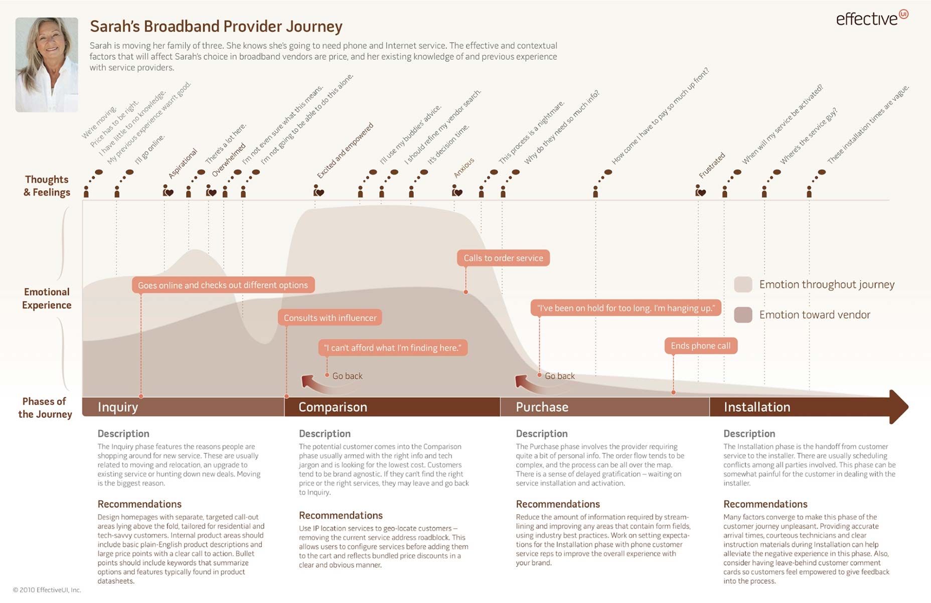
Design for the entire user journey. Don’t just approach web design one page at a time; consider the way user traffic will flow throughout. Create a user design map to see how the average user might feel and what they might experience each step of the way. Each step of the journey presents its own goal. Here are some places users commonly experience friction
Inquiry phase – When users come to the home or landing page, they’re shopping for new information or a service. Friction can be caused by unclear information, a lot of text, or clutter that makes the user feel overwhelmed.
Comparison phase – The user has an idea what they want – now they’re shopping for the best value. Friction comes if they can’t find the right price or locate the services they’re seeking. If the website has convoluted search processes or asks for too much info, the user might go back to the inquiry phase with a competitor. To reduce friction, label things clearly and make discounts obvious.
Purchase phase – The order is ready to commit. Make it clear what the customer will receive and when they can expect it. Keep in mind they’re being asked for a lot of personal information; make it as easy as possible by asking for as little input as possible.
Waiting phase – Reduce friction even after the user leaves your site. Keep them updated while they wait on products or services to reduce anxiety.
Use as few steps as possible. Count the number of steps a user has to take each time they want to accomplish a goal. For example, logging in might require opening a window, clicking in the field for username, typing in the username, clicking on the password field, entering the password, and hitting submit.
Instead, make the login window open automatically with the cursor already in the username field. Allow users to save their information so they only need to click the login button.
Follow recognizable patterns. When users have to learn a new way of accomplishing tasks, it causes friction. Use drop-down menus to make navigation easy. Keep icons user-friendly, like using a magnifying glass for search and the standard icon for email.
Use chunking. The average human user can hold around seven items in their working memory. Divide content into related chunks to help users make sense of it and retain content. This works with processes, as well. When users must go through several steps to complete a task, consider a progress bar at the top that shows what step they’re on and how much progress they’ve made.
Make frictionless design your business goal, and you’ll help users reach theirs. Speed up interactions, improve conversions and create a positive experience with your brand that keeps customers coming back for more.

