As a front-end web developer, my passion centers around all things modern, extendable and well documented. Bootstrap 4 ticks all of those boxes – and then some. In many ways, Bootstrap has shaped and driven the mobile-first movement in web design (responsive web design, specifically). With its breadth of extensive HTML, CSS and JavaScript functionality, one cannot help but be taken aback by its usefulness. However, to first understand a bit about what’s new in the upcoming 4.0 version of Bootstrap, it’s important to understand what Bootstrap is, and what it isn’t.
What is Bootstrap?
Bootstrap is not a template, nor is it a theme or any other variant of that moniker. Bootstrap is more akin to a collection of premade CSS/JavaScript classes and components which you can use to build a responsive website foundation – without re-inventing the wheel and writing boilerplate markup for each project. Think of Bootstrap as the “framework” in a house, which is modifiable, extendable and allows for unique and custom designs to be applied over.
Prerequisites for working with (and understanding Bootstrap) are required in the following front-end disciplines: HTML5, CSS3, JavaScript, as well as a general knowledge and grasp of web design (and mobile responsive) principles. While there are other options out there, such as: Foundation, Materialize, PureCSS, SemanticUI, Skeleton, UIKit and Unsemantic — as a general rule we here at Imagine Monkey prefer Bootstrap for the majority of our projects.
What’s New With Bootstrap 4?
So, now that we’ve gotten the Bootstrap introduction out of the way, I’ll take a moment to cover a few of the most important changes and updates in the latest Bootstrap revision. While there is no definitive release date scheduled for Bootstrap 4, and with 400+ issues still remaining for the v4 branch (as of writing this article), it’s probably safe to assume that a tentative launch is just around the corner as soon as remaining issues are resolved. Now, without further ado… here are just a few exciting updates to look forward to in Bootstrap 4…
Moving from LESS to SASS
Many web developers have heeded the CSS preprocessor call and migrated to the promise-land over the past few years. Here at Imagine Monkey, we’ve advocated the use of CSS preprocessors in our development stack because of the time it saves us using them by utilizing DRY as in Don’t repeat yourself (as opposed to WET, or Write everything twice). Akin to Foundation’s choice to use Sass as their preprocessor, Bootstrap 4 has also been built from the ground-up using Saas as opposed to Less due in favor of its ability to use variables & mixins (it also compiles faster thanks to Libsass).
Optional Flexbox Support
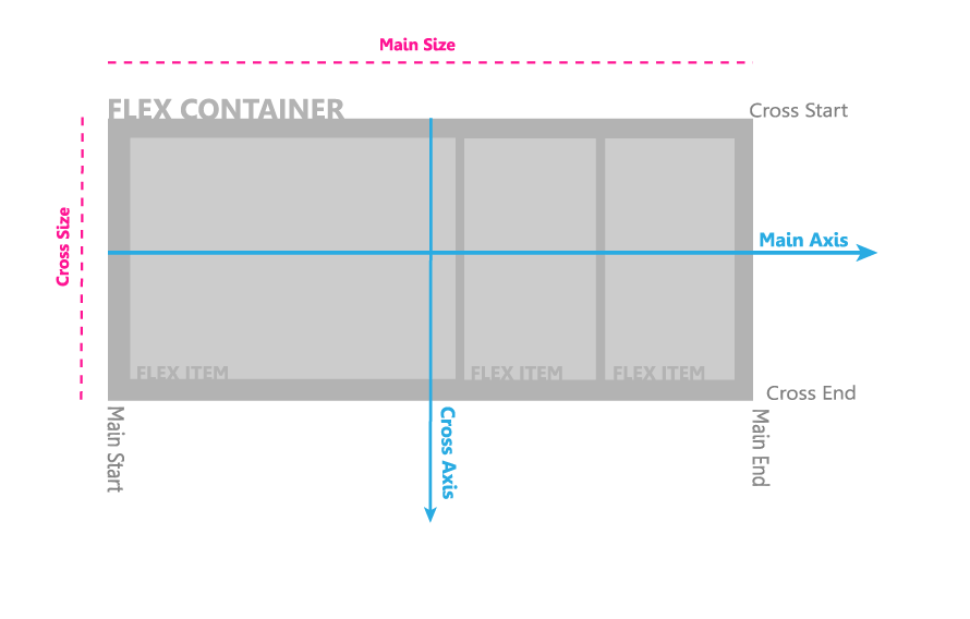
Flexbox, or “CSS Flexible Box Layout Module” is used mainly in responsive websites to provide a cleaner arrangement of page elements. Flexbox accommodates said elements inside flexible boxes that ensure that every feature is displayed properly, in any screen size or resolution.
While there is limited browser support for this new layout mode, there are a number of number of JavaScript shims/packages as a fallback for browsers which currently lack Flexbox support. It’s also important to point out that all grid components will immediately switch to using Flex Box without requiring the developer to adjust their HTML syntax at all.
Undoubtedly, from a front-end developers perspective, one of the neatest features of Flex-Box (hence the term “Flex”), is that the heights of columns will automatically match without needing to use “hacks”. No more forcing the height manually if your content doesn’t align properly. Yay.
New “Card” Component
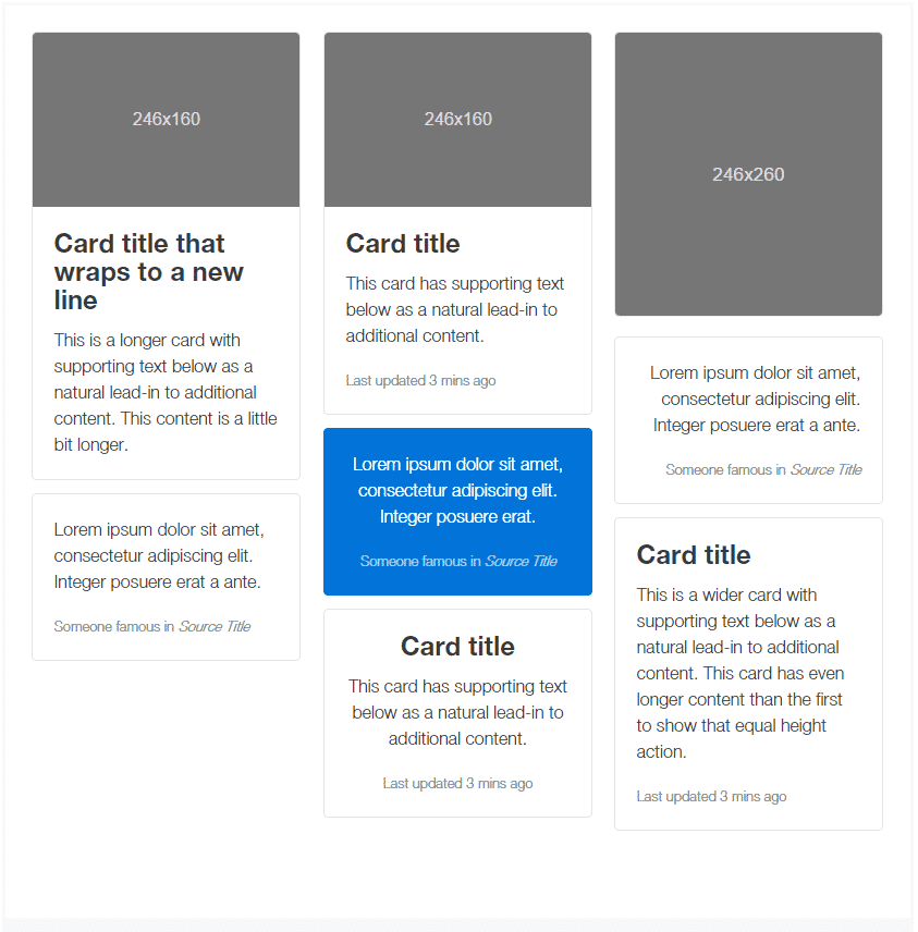
Where there were once “.panel” and .”well” components in Bootstrap 3, these components have been depreciated in favor of the “.card” component. Cards are defined as:
– a flexible and extensible content container. It includes options for headers and footers, a wide variety of content, contextual background colors, and powerful display options.
Basically, these “panels” are individual content-blocks packed with feature-rich options for styling and functionality. Think of them as content divs with some pre-baked JavaScript functionality sprinkled with some design elements applied.
ES6 Support & jQuery 2.0 Support
A “bright new future” has indeed arrived with the release of ECMAScript 6 (which is the next version of the hugely popular client-side scripting language, JavaScript). In order to take advantage of the latest JavaScript enhancements, Bootstrap has rewritten all of their JavaScript plugins in ECMAScript 6. Plus, now that Internet Explorer 8 support has been nixed in Bootstrap, it’s safe to use jQuery 2.0 with Boostrap 4. The benefits of jQuery 2.0 means a smaller footprint with more features and better loading times.
Increased Performance
At Imagine Monkey, we’re advocates of client-side performance over fancy frills and other fancy elements which may bloat a website. Luckily, Bootstrap 4 is ~88kb compared to Bootstrap 3, which was ~123kb in size. That’s just a bit over a 30% increase in performance. And, when pulling Bootstrap in via MaxCDN – that’s 30% better performance when loading this offsite resource.
In Conlusion
Wrapping things up, it’s not stretch of the imagination to believe that Bootstrap 4 will be anything less than a great advancement in the front-end UI framework world. Judging by the improvements and dedication from the core developers that we’ve seen so far, Bootstrap 4 appears to be shaping up as great leap-forward in modern front-end web development.
Further Reading
If you would like to learn more about Bootstrap 4, please find these additional resources:

