Imagine Monkey · Selected work
Marathon Capital Management

More project images 3
Project Details
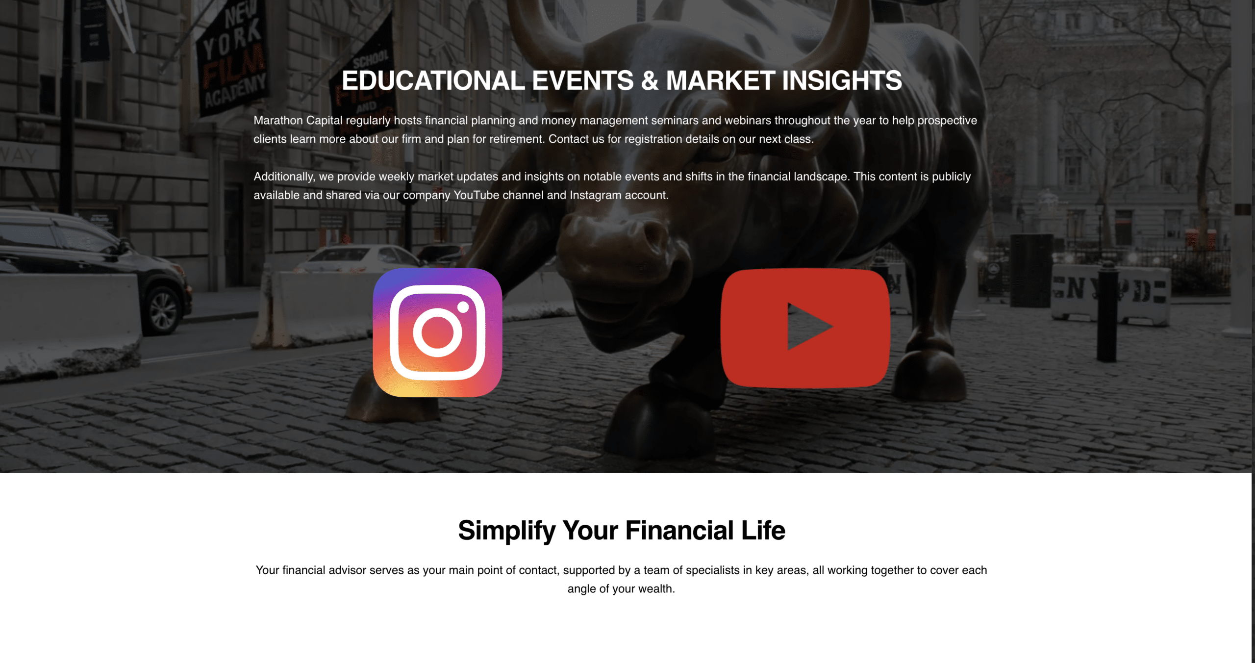
Marathon Capital Management approached Imagine Monkey during a rebrand, with an existing templated website that needed a more distinctive presentation. The assignment was deliberately focused: create a video-led, single-page website that could introduce the firm with confidence, give the new identity room to stand out, and feel considered from the first screen to the last.
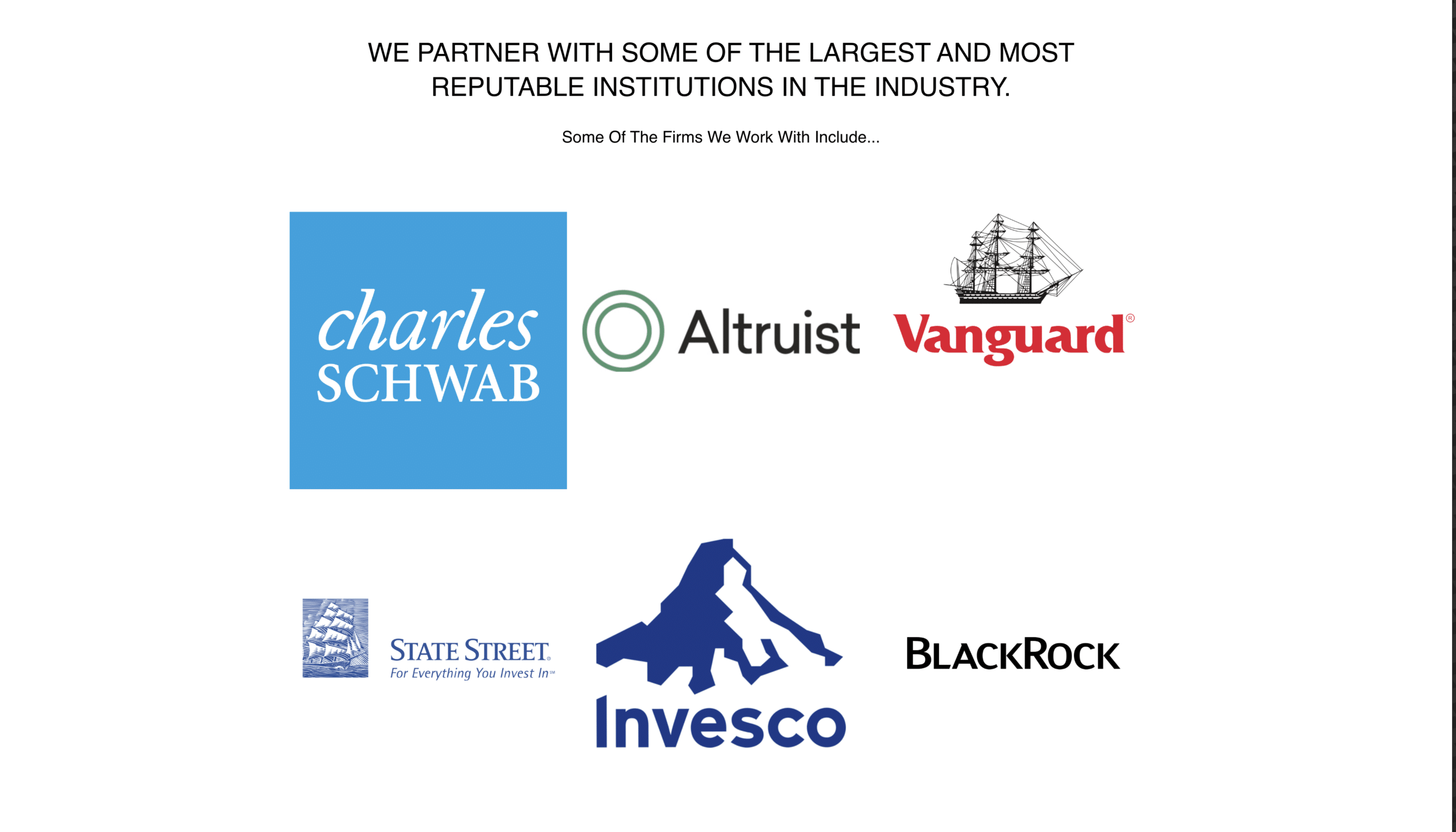
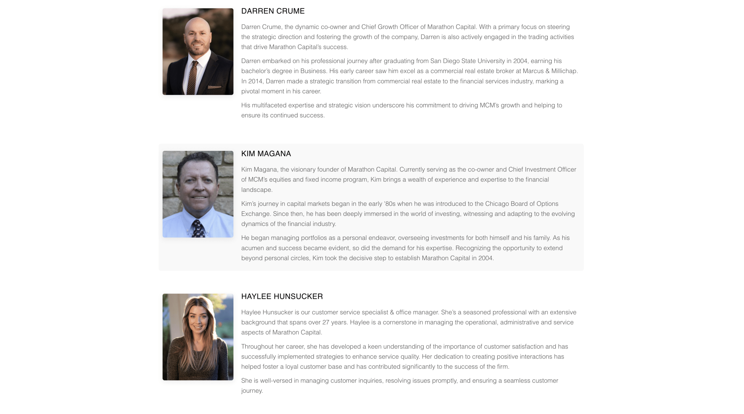
The visual direction pairs architectural imagery with a restrained dark palette, warm gold typography, and a clear central message. These choices give the opening section a recognizable character without asking visitors to sort through unnecessary decoration. Instead of spreading the introduction across numerous pages, the design brings the experience together in a concise sequence, balancing visual impact with readability and ease of use.
Challenge
- Move beyond the original template: Give Marathon’s rebrand a presentation that feels specific to the firm rather than relying on a familiar, off-the-shelf layout.
- Balance motion with clarity: Make video an important part of the experience without allowing it to compete with the company’s name, message, or essential information.
- Make one page feel complete: Establish a clear order for the content so visitors can understand the firm’s identity without navigating a collection of separate pages.
- Keep the experience adaptable: Carry the same visual direction across desktop and mobile screens while paying attention to typography, media, page weight, and usable layouts.
Solution
Our team designed and developed a custom, mobile-first landing page using HTML5 and Bootstrap-based components. We built the presentation around the visual identity, using scale, contrast, and deliberate spacing to connect the architecture-inspired imagery, prominent Marathon wordmark, and the supporting content into one coherent experience.
With video and large visual elements playing a central role, the implementation also called for careful treatment of media and responsive behavior. We considered how the composition changes on smaller screens, how text remains readable over strong imagery, and how the page can communicate its purpose without relying on motion alone. Structured-data considerations and efficient front-end development complemented the design work.
Results
The finished website presents Marathon’s rebrand through a clearer, more unified digital identity. Its single-page format brings the central message forward, while the restrained typography, architectural imagery, and video-focused presentation create a consistent visual tone throughout the experience.
Just as importantly, the design was built with mobile use and everyday browsing in mind. The project brought together visual storytelling, responsive components, and a performance-conscious front end to deliver a more purposeful alternative to the original template, without losing the simplicity of a one-page website.